Monday, January 31, 2011
Emerging Markets Model Performance Through Jan 2011
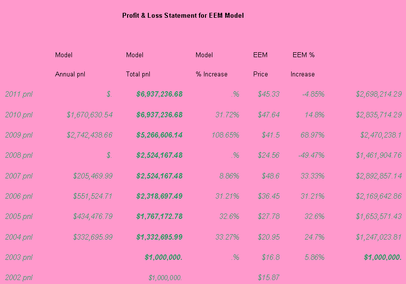
The table below summarizes the results of our strategy as applied to the EEMs (Emerging Markets ETF). We exited a long position in late November 2011 and are currently neutral.

Thursday, January 27, 2011
Cumulative Performance Of QQQQ Model
In this post I want to summarize the performance of our QQQQ model from inception. We recently exited a long position on January 14 2011 and are currently neutral. The QQQQ model is an example of our slow trading systems which identify longer dated trends and stick with them. The key to the model is to avoid major pitfalls and downturns. The model can be either in or out of the market for long periods of time. Most notably when the NASDAQ bubble burst in 2000 the model stayed out of the market while the NASDAQ lost half its value. The model goes long in 2002 and avoids the meltdown in 2008 going long again in 2009. The purpose of this model is identify long term trends. It is worthwhile noting that if you invested $1000,000 in the QQQQ at the end of April 2000 you would still be down over 40% by today. Whereas if you traded the QQQQ ETF using the model you end up 340% over the same period with much less volatility.

Wednesday, January 26, 2011
A Correlation Study between ETFs
The other day I was reading an article in Seeking Alpha by Erik Gholtoghian in which he established a multi-factor capm model between DRYS, SEA and USO which can be summarized as follows:
DRYS weekly % change = 1.38*weekly% change in SEA+.56*weekly %change in USO.
SEA is the Guggenheim/Delta Global Shipping ETF which was introduced in the middle of last year, OIH is the Merrill Lynch Oil Service Holders ETF. I decided to conduct a study that examined the correlation of SEA with respect to commodities that are shipped by DRYS container ships. In the first chart the correlation matrix includes data from the SEA ETF which started trading in June last year. The strongest relationship exists between XLE and IYM for 06/14/2010 till present and from jan 3 2007-present. There is also a strong correlation between SEA and IYM and XLE over the much shorter period. These represent potential trading opportunities assuming that pairs trade within certain ranges and they mean revert.


The first chart below summarizes the relationship between IYM and XLE from January 2007 till the present. Clearly there are buying opportunites when IYM trades below XLE and selling opportunties when IYM crosses above XLE. There are a few ways to play this one could go long IYM at some point after crossing XLE from above and waiting till it once more crosses XLE from below. A second trade is to buy XLE and Sell IYM when the spread between the two has widened and close out the position when it converges.
In the second chart below I incorporate the SEA data from 06/14/2010
till present.


Friday, January 21, 2011
Some Interesting Charts
I decided to perform a study which examined the relationship between DRYS which is the largest carrier of dry bulk goods by market cap vs some key ETFs. DryShips, Inc., engages in the ownership and operation of drybulk carriers and drilling rigs that operate worldwide. Its drybulk fleet principally carries drybulk commodities, including coal, iron ore, and grains; and minor bulk items, such as bauxite, phosphate, fertilizers, and steel products. DryShips also engages in the shipment of oil based products throughout the world. The ETF's I selected for the study were as follows IYM (Basic Materials), SLX (Steel), XME (Metals and Mining), OIH (Oil). All of these ETF's have exposure to stock holdings in the various sectors.
In the first chart below I divide the ETF Close Price by the DRYS Close Price for that day. These ratios achieved their low points in October29 2007 this coincided with a peak in DRYS. Note that IYM, SLX, XME and OIH peaked in August 2008 so that the peak in DRYS preceded the subsequent collapse in IYM, SLX, XME and OIH by ten months. The various ratios all achieved another peak in early March 09 which represented a major buying point in the markets. These ratios are once more achieving new highs as we speak which bodes well for for IYM, SLX, XME and OIH. I will analyze this line of thought further for my next posting when I will examine both the current and lagged returns of DRYS vs the ETF returns.


In the first chart below I divide the ETF Close Price by the DRYS Close Price for that day. These ratios achieved their low points in October29 2007 this coincided with a peak in DRYS. Note that IYM, SLX, XME and OIH peaked in August 2008 so that the peak in DRYS preceded the subsequent collapse in IYM, SLX, XME and OIH by ten months. The various ratios all achieved another peak in early March 09 which represented a major buying point in the markets. These ratios are once more achieving new highs as we speak which bodes well for for IYM, SLX, XME and OIH. I will analyze this line of thought further for my next posting when I will examine both the current and lagged returns of DRYS vs the ETF returns.


Tuesday, January 18, 2011
For Gold And Silver Bugs
Below I am enclosing the results of my gold and silver models. The trend following models I employ are eant to capture long established trends in the underlying assets. The GLD model entered the position in April 2005 and remained long through mid October 2010. Note that in this particular instance the model more or less mimics the underlying GLD ETF.
The Silver Model modestly outperforms the SLV ETF but does so with approx 40% less volatility. The rules for entry and exit are established in order to determine exit and entry points. This methodology has worked well in both the QQQQs, EWZ, EWH in particular (refer to my first posting for results through Nov 2010).
The idea is to have a model that captures long term trends in multiple markets by applying a similar process for determining rules. I have been playing around with some shorter dated models and will post the results of those when I am satisfied with the progress. The ideal end user of these models would be fund managers adopting a long term horizon who may either use this model to trade these ETFs or to use it as an overlay to manage there own stock picking. These models will not appy to the HFT community many of whose models success relies on picking off ones customers through the ability to co-locate their servers with the exchanges.


Monday, January 17, 2011
An Index and ETF with Exposure to Africa
Since this is MLK day I thought I would talk about an index that gives exposure to the African region. One way such Index is the "Dow Jones Africa Titans Index". "The Dow Jones Africa Titans Index" is a pan-African index consisting of stocks trading on domestic exchanges as well as companies on international exchanges that obtain the bulk of there revenue from Africa. As of now the local exchanges of South Africa, Egypt, Nigeria, Morocco, Kuwait and Kenya are considered. To be considered a company must have a minimum market cap of $200 million dollars and a minimum one year trading volume of $million per day. The most recognizable stocks to the international community may be Orascom Construction Industries the huge Egyptian construction conglomerate and Nigerian Breweries PLC. According to Dow Jones web-site the country and sector allocations are as follows as of Dec 31 2010.
South Africa 25.70% Financials 41.21%
Egypt 20.51% Basic Materials 19.27%
Nigeria 16.46% Telecomm 11.76%
Morocco 11.14% Oil and Gas 10.31%
UK 10.01% Industrials 6.52%
Canada 5.29% Consumer Goods 4.48%
Kuwait 4.33% Technology 4.33%
US 2.21% Consumer Services 2.14%
Australia 1.59%
Kenya 1.46%
Norway 1.32%
One product that allows an investor to gain exposure to this index is the Market Vectors ETF distributed by Van Eck Securities Corporation and seeks to track as close as possible the Dow Jones Africa Titans index. Note this particular ETF is not sponsored, endorsed or promoted by Dow Jones. The ETF may be found under the symbol AFK. Of course investors need to do their own due diligence as to whether this type of product is suitable for them and their own risk appetite. More info on The Dow Jones Titans Indices may be found at the following link http://www.djindexes.com/titans/ and info on the Africa ETF AFK can be found at www.vaneck.com. I am sure given the explosion in ETFs that there will be other ETF's that will be created focussing on the Africa region and these may be less heavily weighted towards financials and more geared towards either Africas domestic resources lets watch and wait.
Important Disclosure
Note that ETFs are subject to a high degree of risk and in discussing this particular ETF it does not in any way mean an endorsement to buy or sell any such securities. Investors need to do their own due diligence as to suitability of this or any other product. ETFs may be affected by market conditions in both developed and nascent markets . Particular risks associated with emerging market ETFs are social instability, expropriation of local companies and assets, political instability and armed conflict and insurgency.
Tuesday, January 11, 2011
A Correlation Study between ETFs
In setting up either long only or pairs trades it is useful to perform a correlation study to determine what happens when correlation breaks down.
Below I present three charts the first is the five year performance of five key ETFs SPY(US), EWZ(Brazil), EWH(Hong Kong), EEM(Emerging Markets), FXI(Shanghai Composite). The second is a specific chart of the ratio of EWZ (prices) divided by EEM (prices). The third chart is a correlation matrix between these assets one a longer dated correlation matrix the second over one year. Note the extremely high correlations between EWZ and EEM. The correlations are applied to 2 month cumulative returns as opposed to intra-day to highlight the relation-ship. Also observe that that in the second chart that correlation can hit some fairly extreme values it is at those extremes that potential trading opportunities exist to either set up a long only position or a relative value pairs trade between the etfs EWZ vs EEM. Note that when correlation falls apart and the ratio of EWZ to EEM prices falls below 1.2 this signifies good entry points to purchase EWZ.
It is also significant that while there is fairly high correlation between all these ETF's that EWZ has by far outperformed the other ETFs. Brazil has the commodities that other emerging markets require to fuel there industrialization and this can help explain the outperformance. Right now the ratio of EWZ to EEM is around 1.6 and correlation is hovering close to 1 extremely high. At this juncture I would adopt a neutral position and await a better entry point when correlation once more breaks down.


Friday, January 7, 2011
Relationship between the VIX and key ETFs
I thought it would be interesting to plot a chart of the VIX vs key ETFs namely SPY's, EWZ (Brazil), EWH (Hong Kong), EEM (Emerging Market). What is interesting is what happens at huge extremes in the period from Oct 2008 to April 2009. The VIX itself adjusted close breached the 80 level twice within the month between 10/26/2008 and 11/20/2008. Note that Lehman Brothers filed for bankruptcy on 09/15/2008 and several other major institutions would have faced the same fate if the US govt had not acted. However it took a further month for the VIX to spike this was preceded by the collapse in all markets. From 11/20/2008 through to mid January the market started to rally again and the air came out of the VIX only to breach the 50 level on 03/02/2009. Notably SPY, EWZ, EWH and EEM hit there lows in early March. This is telling us that when you have the VIX hits extreme levels. From the perspective of an investor the most liquid volatility ETF product is the iPath short term futures VIX ETN (VXX). Specifically, the S&P 500 VIX Short-Term Futures™ Index TR offers exposure to a daily rolling long position in the first and second month VIX futures contracts and reflects the implied volatility of the S&P 500® Index at various points along the volatility forward curve. The index futures roll continuously throughout each month from the first month VIX futures contract into the second month VIX futures contract. More details can be found at http://www.ipathetn.com/ .

Wednesday, January 5, 2011
LongTermTrendSystemResultsthroughNov2010
Enhanced Probability Technical Trading Strategy Summary
Strategy Methodology- The idea was to combine technical analysis with statistical methods (distribution theory) in order to identify long term trends and turning points in the market considered. The idea is to create a strategy that both outperforms the underlying market with less volatility than the underlier. Several proprietary technical indicators are considered and there statistical distributions analyzed to determine buy and sell levels which are incorporated into a signal generator.
Trades are only entered only after confirmation of several statistical and technical factors (this leads to a higher probability of a successful trade). The trades are long term in nature as they go with the trend. The period of analysis uses data from the 1999 or the inception of the ETF whichever is available. It considers several bear markets including the most recent one which help stress test the strategy and set acceptable risk levels. The strategy deploys a framework that increases the likelihood of a successful trade; stops are used to exit losing trades. The strategy is deployed in various markets where there are high volume ETFs available.
Asset Selection- The strategy focuses on identifying appropriate entry and exit points in the most liquid exchange traded funds (ETF’s). The reason for this is for both liquidity and scalability (numerous strategies focus on asset selection but ignore the need to scale for commercial viability). The ETF’s selected are as follows SP500 Spider, NASDAQ (QQQQ’s), Emerging Market Index (EEM), Gold (GLD), Silver (SLV) and Oil (OIH). Note that in this initial phase of development the asset markets selected are diverse in that they comprise NASDAQ, SP500, emerging markets and commodities. The same methodology can also be applied to individual stocks however the results I present here are for major market indices in the form of ETF’s.
Results
In this document I post the results for the NASDAQ, SPY, EWZ and EEM ETF (see below). The other models are available in the spreadsheet attached along with Trade Statistics. (See attached)
The data considers several periods of dislocation in analyzing the system. Namely NASDAQ Bubble Bursting, 2001-2002 bear market, 2008 credit crisis. For example the NASDAQ Model did well in 2000 and stayed out of the market during this period and stays out during 2008. The best year dollar wise is 2009 for the NASDAQ Model. $1million dollars invested in the NASDAQ Model would result in total balance of over $3.28million by Nov 2010 compared with a loss of over 40% over the same period if invested in the underlyer. The SPY Model increases by almost 100% for this period vs a slightly negative performance in the SPY ETF.
Strategy Deployment-- The strategy is ideally suited for a wealth management firm, mutual fund, or long only hedge fund that would deploy client capital in accordance with the signals to establish a “technical long fund or fund of fund (via allocation to multiple asset classes)”. These strategies are also ideally suited to institutions/family offices/insurance companies/endowment funds who are tired of paying extremely high fees to fund of funds and hedge funds.


Subscribe to:
Posts (Atom)